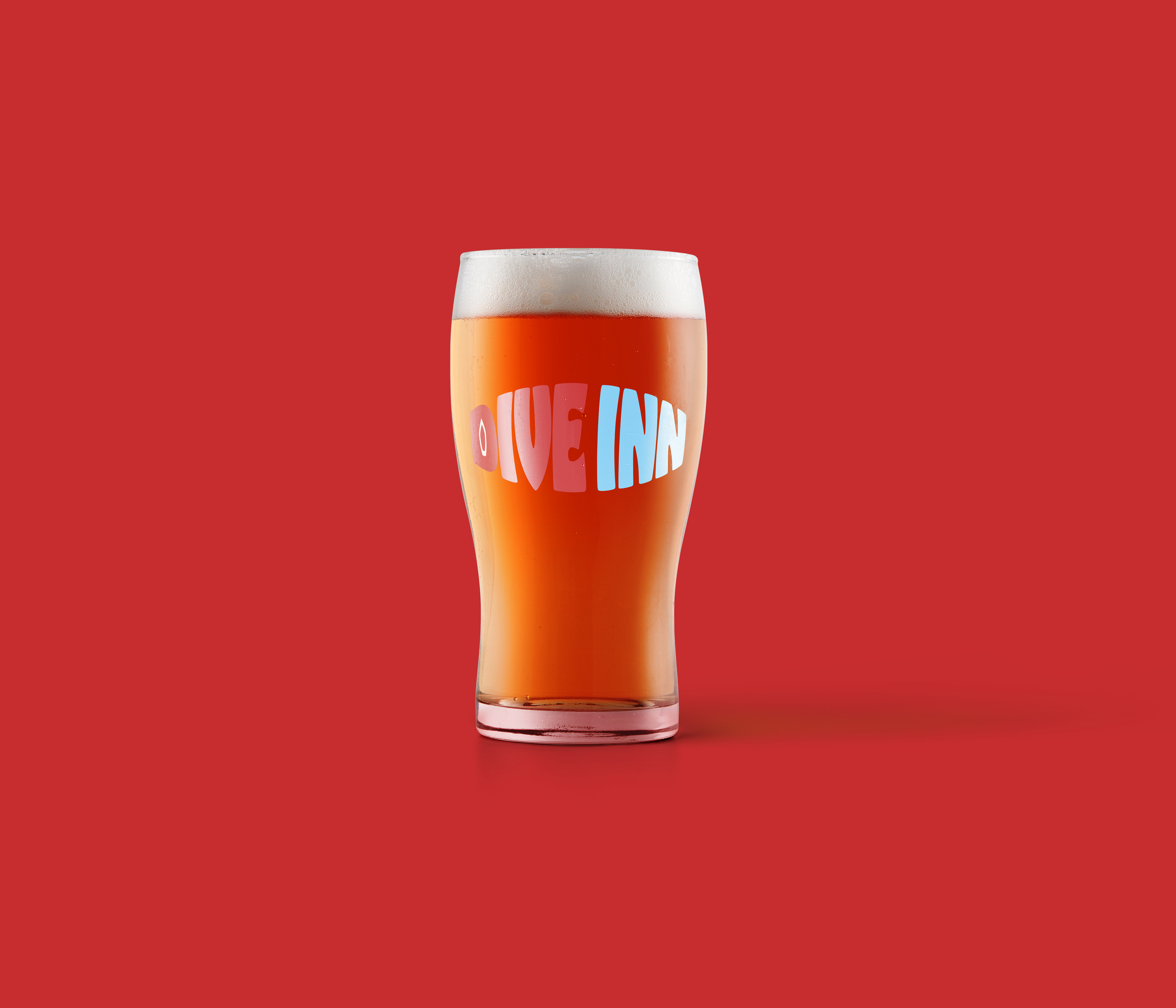
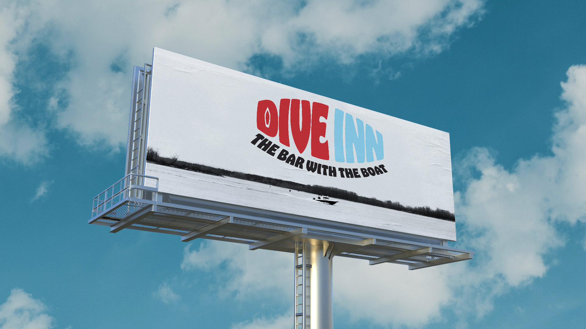
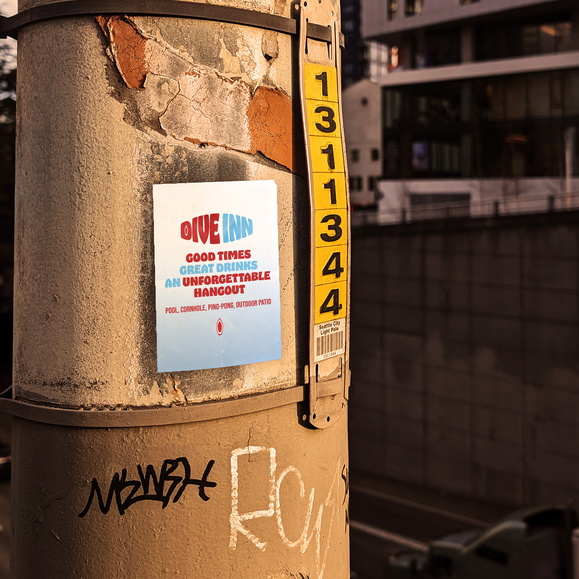
Dive Inn is a dive bar in Platt Park neighborhood in Denver, Colorado. This personal project spawned from wanting to capturing the vibrant, no-frills spirit of my former local dive bar that's all about fun and community. This lively spot is known for one unforgettable feature: the boat sitting right in the middle of the bar. It’s quirky, it’s bold, and it’s the perfect focal point for a place that doesn't take itself too seriously.
In this logo design/brand-identity piece, I wanted to evoke that same sense of energy, fun, and local charm. Everything about this project reflects the unpretentious and welcoming atmosphere of the bar itself. It’s all about good times, great drinks, and an unforgettable hangout.
Client: Personal Role: Graphic Designer Year: 2024
My Approach: Logo
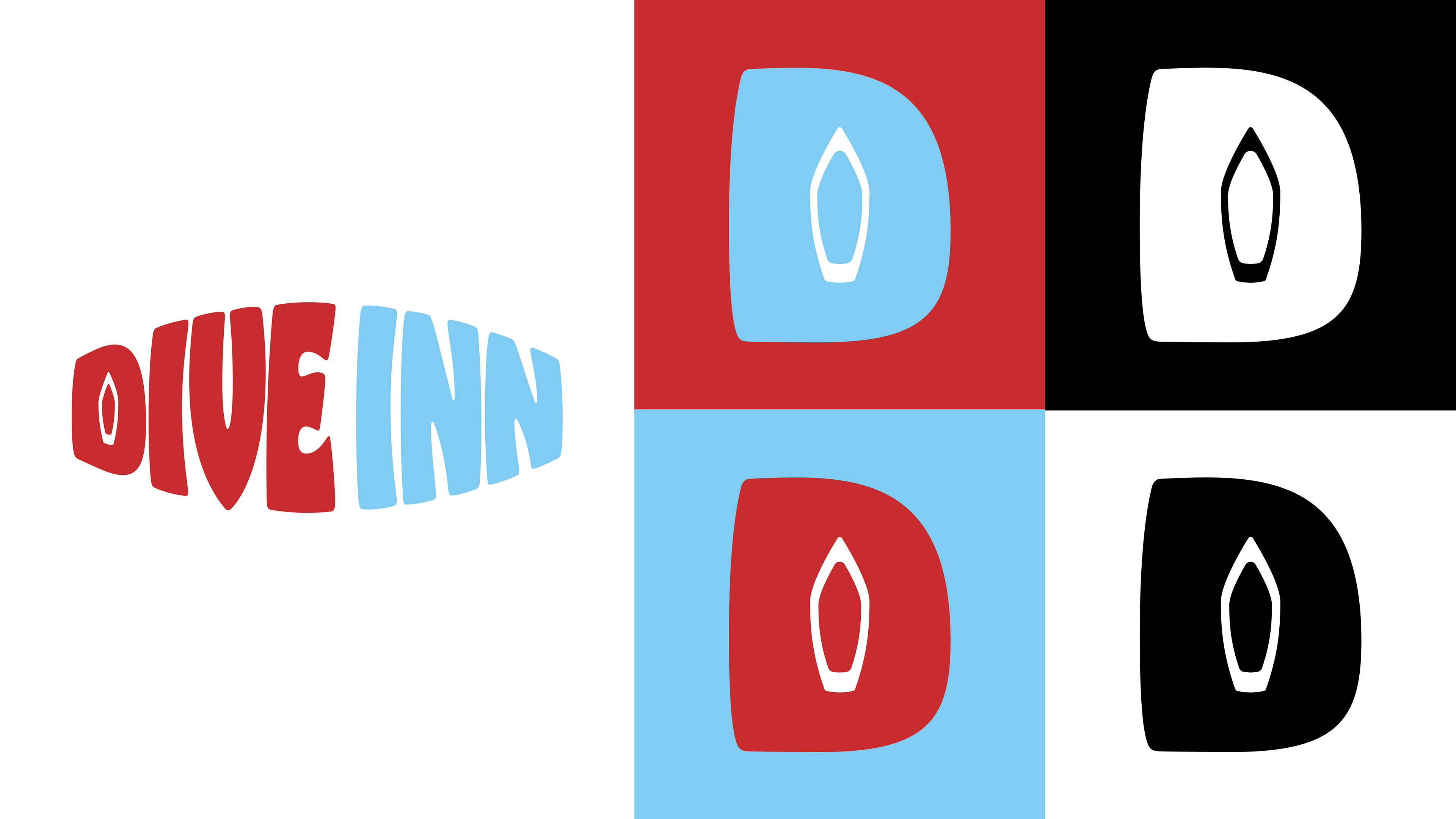
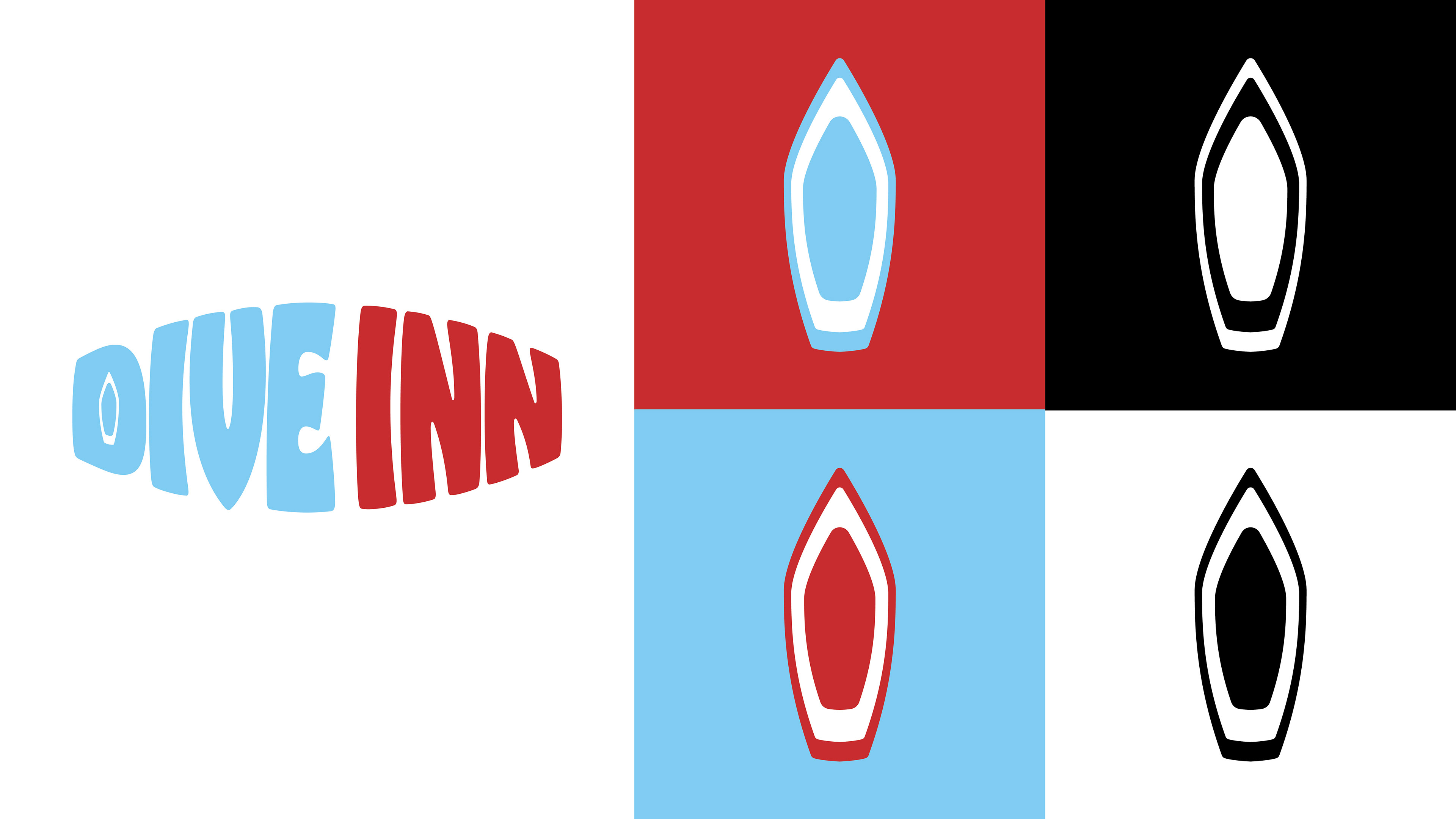
Dive Inn's standout feature is the "boat in the middle of the bar," which inspired me to incorporate this unique element into the logo designs. On the left, I’ve created a main logo paired with a secondary "D" logo, where the boat acts as the negative space within the letter. On the right, I’ve showcased the main logo in a different color variation, along with a tertiary logo featuring just the boat, which I designed in Adobe Illustrator.
My Approach: Typefaces
Dive Inn embraces a laid-back vibe and doesn't take itself too seriously. For the primary typeface, I selected Hobeaux Black because it's bold, quirky, and playful—just like Dive Inn itself, but not overly loud. For the secondary typeface, I went with Bebas Neue Regular, chosen for its strong legibility and the way it complements the bolder Hobeaux, creating a nice contrast between the two.
My Approach: Color Palette
Stepping into Dive Inn feels like you're hit with a wave of unexpected nostalgia. Fake palm trees that almost look real, a boat in the middle of the bar, and yacht rock playing overhead—it’s like a scene plucked straight from Jimmy Buffett’s "Margaritaville." Personally, I can’t think of anything more classically American late '70s/early '80s than red and blue, but with a retro twist, of course!
